
About a week ago, I came across Exabytes website . They were hosting Exabytes " I Want a MacBook Air " Contest Prize. Of course, I did not want to miss this opportunity; therefore, I joined the competition. Now, I am one of the first 100 participants to preview their new website{Gosh, how lucky I was because I just found out the contest on the deadline!} Anyway, after that, they sent the link, the username, and the password in order to log into the new Beta Website. I was really ecstatic!!!! Since I am given this job, let's have fun!
Firstly, I would like to do a very-detailed review on this new website. Since it is still in BETA version, there are still some parts seemed like unfinished. However, I really need to help them to speak up because it is really not easy to design and finish a website! I tried it before for my assignments{It was likehell a nightmare! Maybe next time, I show them to you all! Okay, cut to the chase, I will review the website on a few criteria :
Yes, basically, these are the criteria for me to write the review. This is somehow reminiscent of my blog survey and my blog results. Therefore, it was definitely wise to do survey even though it is quite annoying at some time. Now, it is time to be professional! I will give good comment in green and negative review in red! Let's get the party started!!!!
In this Beta version Website, the design seems more professional compared to the old version. I really like its layout which is simple in its alignment and sophisticated in its colour usage. First of all, the new website's menu bar is really nice and convenient to use. This is because the drop-down menu bar has categorized all the sections neatly. With this feature, users can have easy access to the info. Now, it is the time to discuss about the colours. Personally, I think that the colours used are simple yet dynamic. White background with blue menu bar is really a match and the advertisements are colourful enough to light up website and attract viewers. This is definitely a plus point. As for the alignment, there is nothing to critisize about because they arrange all the sections in a very nice and simple way.
User-friendliness is obviously one of the most important aspects to create a great website. For Beta Exabytes Website, I have to say that the drop-down menu bar is really user-friendly. The bar helps people to save time to look for information. Besides that, I also like the fact that they separated the old "Productions and Services" tab into 2 tabs which are "Web Hosting" tab and "Services" tab. By doing so, the tabs would not cluttered together which might results confushion for the users. However, the new website has expelled one of my favourite parts in the website - The small shortcuts at the top of the website. Besides, I also can't find the "Home"section" at the drop-down menu and "log in" section the new site. On the other hand, they have added some very nice sections such as testimonials section, client section, and products and services listing. This sections make the website more firm and more interesting. Now, going into more detail parts. To be honest, I tried the website thoroughly. I went to the "Xtudent Web Hosting" through the drop-down menu. Well, I really like the newly improved part. Instead of putting all the information in the same page like the old page, they systematically group all the info into 3 main tabs - "Overview", "Features", and "F.A.Q". I have to say that this new feature is really nice to use. However, on the same page, there are some advertisement sections that you can expand and collapse which are not really necessary. Instead of that, they should have include a website navigator by the side. Anyway, with the newly-added GOOGLE SEARCH, I also happy that I can find my info faster and easier. In addition, there is even an EXPRESS SEARCH for new users and old users. This is one of the best features added because this is really user-friendly.
Last but not least, it is important that the website has to be content-wise and creative at the same time in order to attract traffic. For Beta Exabytes Website, the content, no doubt, is very informative and specific even for new users. In the sense of creativity, the new website still lacks the "X" factor. How would I put this? Like when they introduce this contest, they put a "click here" at the top right of the old website. When your cursor scroll there, the page will "peel" off. That is creativity! Maybe the new page is still in Beta construction, I really can't expect too high!
Well, this is the first time I did a review on other website. I had a lot of fun. The great experience about doing this is that not only I can genuinely give my ideas, but I can also learn from my own comments. To sum up, the Beta Exabytes Website is quite an improvement. I also enjoy surfing its website. Not to mention that the design is definitely "cool". However, there are certain important sections are missing. Overall, the website is great; but, they have to relocate some important elements. Hopefully, the Exabytes official will take my comments into account to improve more. I am always glad to be able to help out(^^)
For more information, please log on to www.exabytes.com.my
Firstly, I would like to do a very-detailed review on this new website. Since it is still in BETA version, there are still some parts seemed like unfinished. However, I really need to help them to speak up because it is really not easy to design and finish a website! I tried it before for my assignments{It was like
- Design - layout, colours, and alignment.
- User-friendliness - Acessibility, Information-location, and relocation of data.
- Creativity and Content - Innovation, comprehensiveness and etc.
Yes, basically, these are the criteria for me to write the review. This is somehow reminiscent of my blog survey and my blog results. Therefore, it was definitely wise to do survey even though it is quite annoying at some time. Now, it is time to be professional! I will give good comment in green and negative review in red! Let's get the party started!!!!
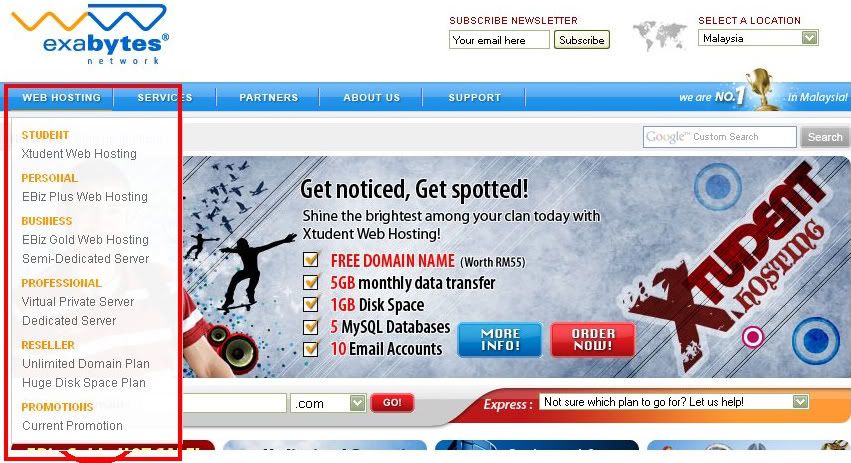
In this Beta version Website, the design seems more professional compared to the old version. I really like its layout which is simple in its alignment and sophisticated in its colour usage. First of all, the new website's menu bar is really nice and convenient to use. This is because the drop-down menu bar has categorized all the sections neatly. With this feature, users can have easy access to the info. Now, it is the time to discuss about the colours. Personally, I think that the colours used are simple yet dynamic. White background with blue menu bar is really a match and the advertisements are colourful enough to light up website and attract viewers. This is definitely a plus point. As for the alignment, there is nothing to critisize about because they arrange all the sections in a very nice and simple way.

The red box is the drop-down menu, it is so cool!!!!
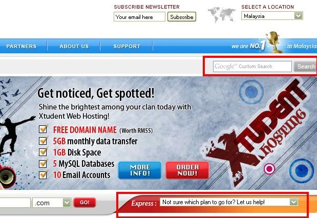
User-friendliness is obviously one of the most important aspects to create a great website. For Beta Exabytes Website, I have to say that the drop-down menu bar is really user-friendly. The bar helps people to save time to look for information. Besides that, I also like the fact that they separated the old "Productions and Services" tab into 2 tabs which are "Web Hosting" tab and "Services" tab. By doing so, the tabs would not cluttered together which might results confushion for the users. However, the new website has expelled one of my favourite parts in the website - The small shortcuts at the top of the website. Besides, I also can't find the "Home"section" at the drop-down menu and "log in" section the new site. On the other hand, they have added some very nice sections such as testimonials section, client section, and products and services listing. This sections make the website more firm and more interesting. Now, going into more detail parts. To be honest, I tried the website thoroughly. I went to the "Xtudent Web Hosting" through the drop-down menu. Well, I really like the newly improved part. Instead of putting all the information in the same page like the old page, they systematically group all the info into 3 main tabs - "Overview", "Features", and "F.A.Q". I have to say that this new feature is really nice to use. However, on the same page, there are some advertisement sections that you can expand and collapse which are not really necessary. Instead of that, they should have include a website navigator by the side. Anyway, with the newly-added GOOGLE SEARCH, I also happy that I can find my info faster and easier. In addition, there is even an EXPRESS SEARCH for new users and old users. This is one of the best features added because this is really user-friendly.

The red boxes indicate the GOOGLE SEARCH and EXPRESS SEARCH.

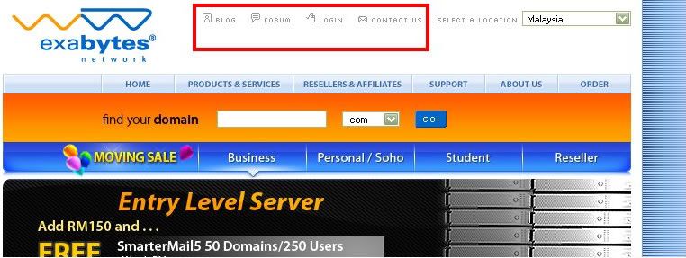
This is the old website. The red box shows the missing shortcuts in the new website.
Last but not least, it is important that the website has to be content-wise and creative at the same time in order to attract traffic. For Beta Exabytes Website, the content, no doubt, is very informative and specific even for new users. In the sense of creativity, the new website still lacks the "X" factor. How would I put this? Like when they introduce this contest, they put a "click here" at the top right of the old website. When your cursor scroll there, the page will "peel" off. That is creativity! Maybe the new page is still in Beta construction, I really can't expect too high!
Well, this is the first time I did a review on other website. I had a lot of fun. The great experience about doing this is that not only I can genuinely give my ideas, but I can also learn from my own comments. To sum up, the Beta Exabytes Website is quite an improvement. I also enjoy surfing its website. Not to mention that the design is definitely "cool". However, there are certain important sections are missing. Overall, the website is great; but, they have to relocate some important elements. Hopefully, the Exabytes official will take my comments into account to improve more. I am always glad to be able to help out(^^)
For more information, please log on to www.exabytes.com.my
4 comments:
cant wait to see the new layout :D
hahaha, yup, it was not completely finish when I log in (^^)
this is quite a detailed review. great post. have a great weekend ^_^
thanks again my friend(^^)
Post a Comment